....
Since I frequently upload my nail designs after they are complete, I think it's about time now I start introducing some tutorials while the designs are in progress.
I will add to here throughout..
Tutorial Image Gallery..
Tutorial; step by step
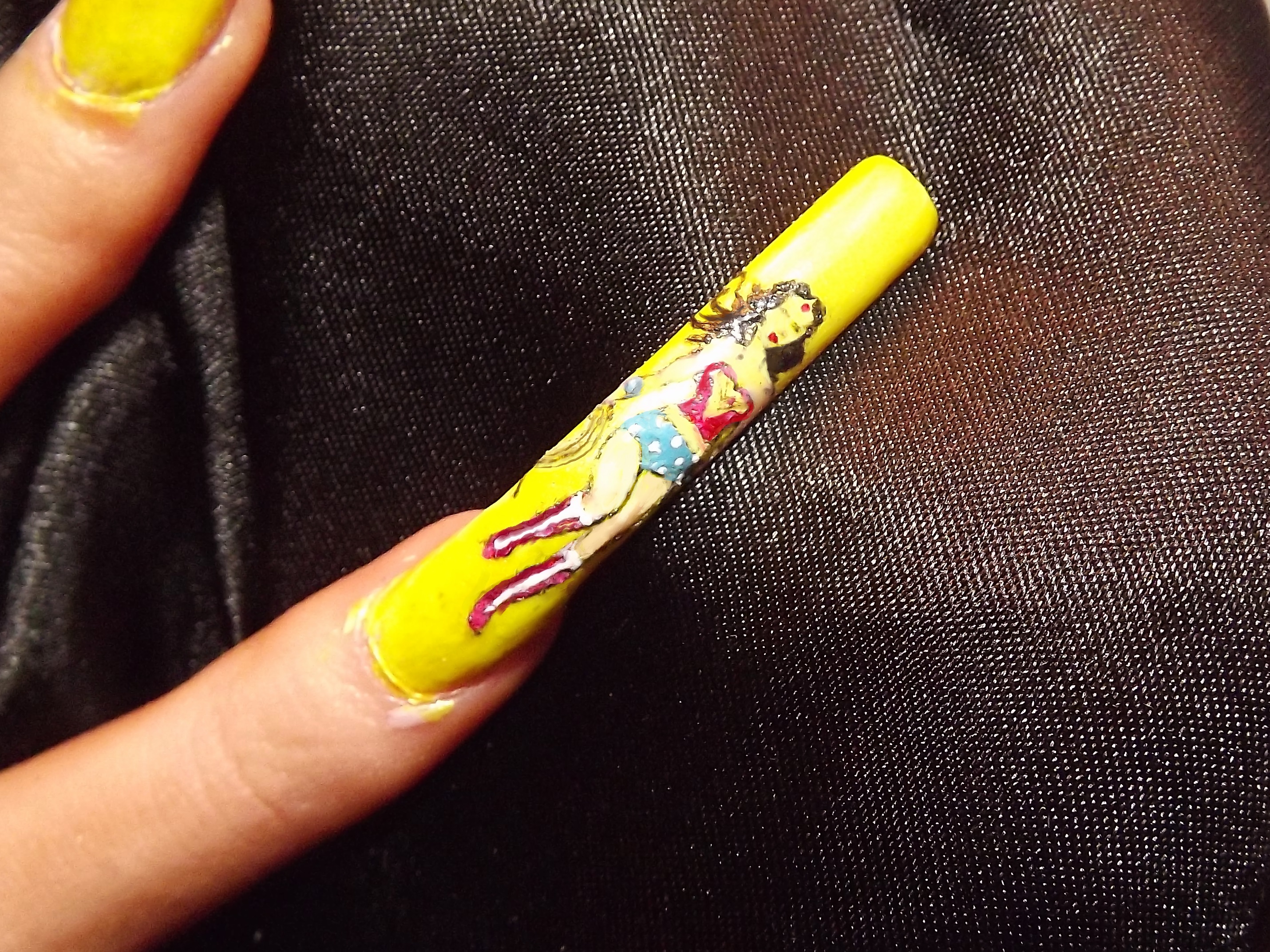
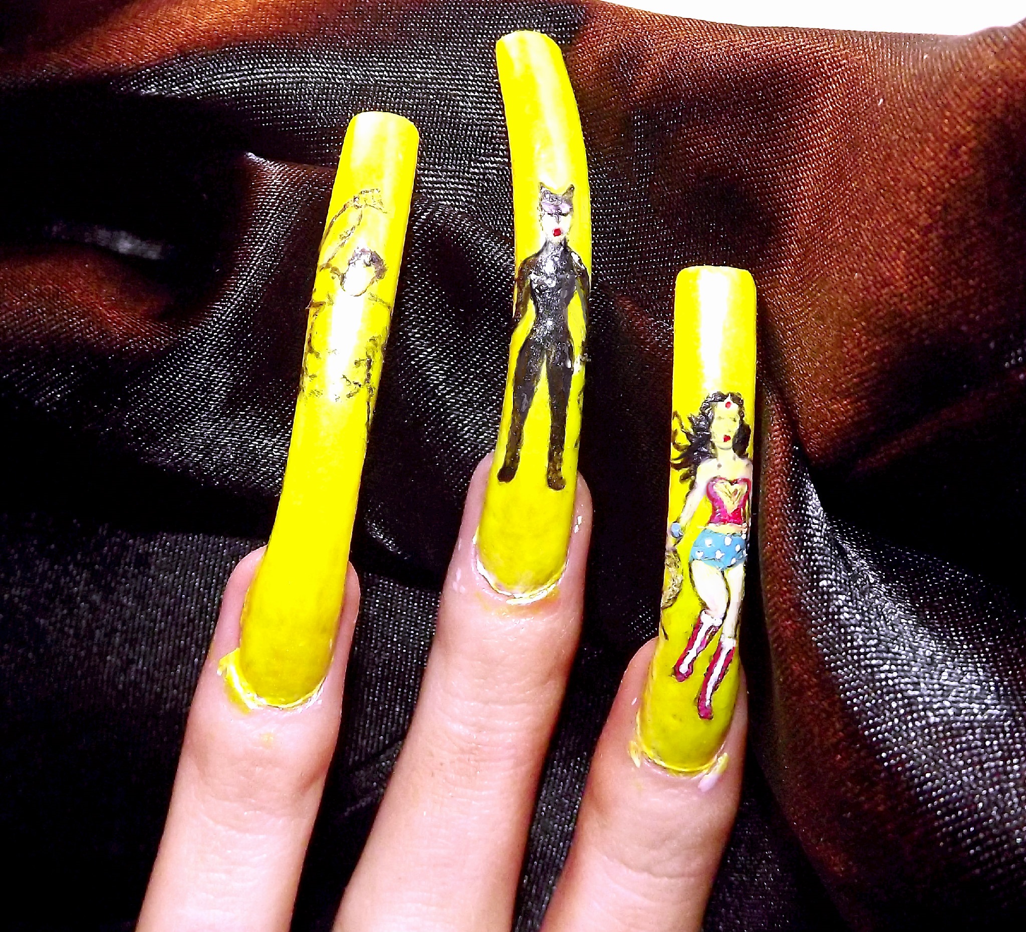
Below picture; Here I was starting the lay out of Wonder woman's face, facial features are relatively easy to do, as long as you use a small enough brush tip that is, it would be impossible to get any detail with anything larger than a pin head tip..
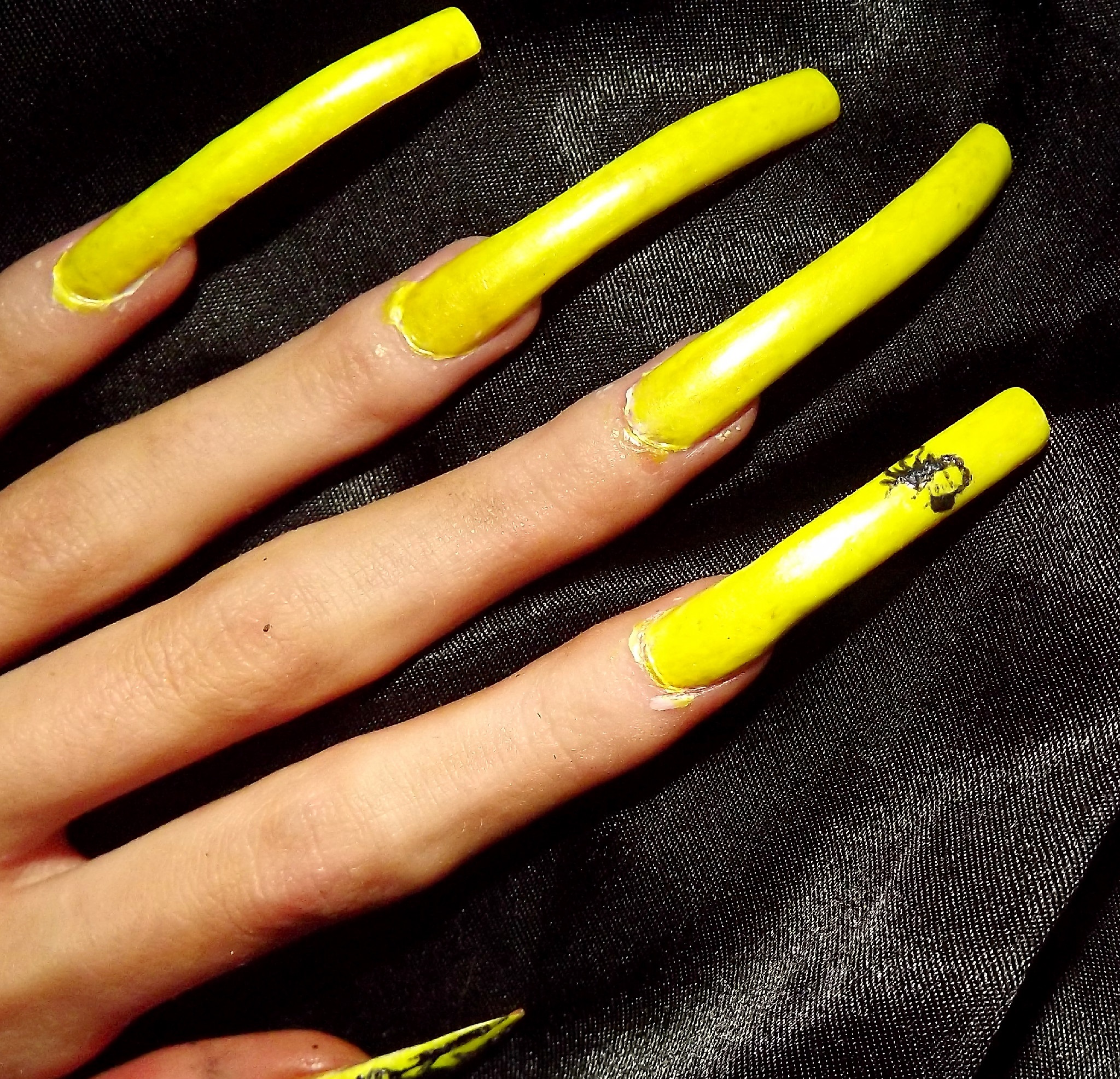
On to the torso; Again, still using the same brush, moving on to the body can be more tricky than the face.. you have to get the proportions correct so you are not left with a small head and a big body, or a large head with a small frame. It can take a few attempts to get it exact, but you will know when you have got it right.
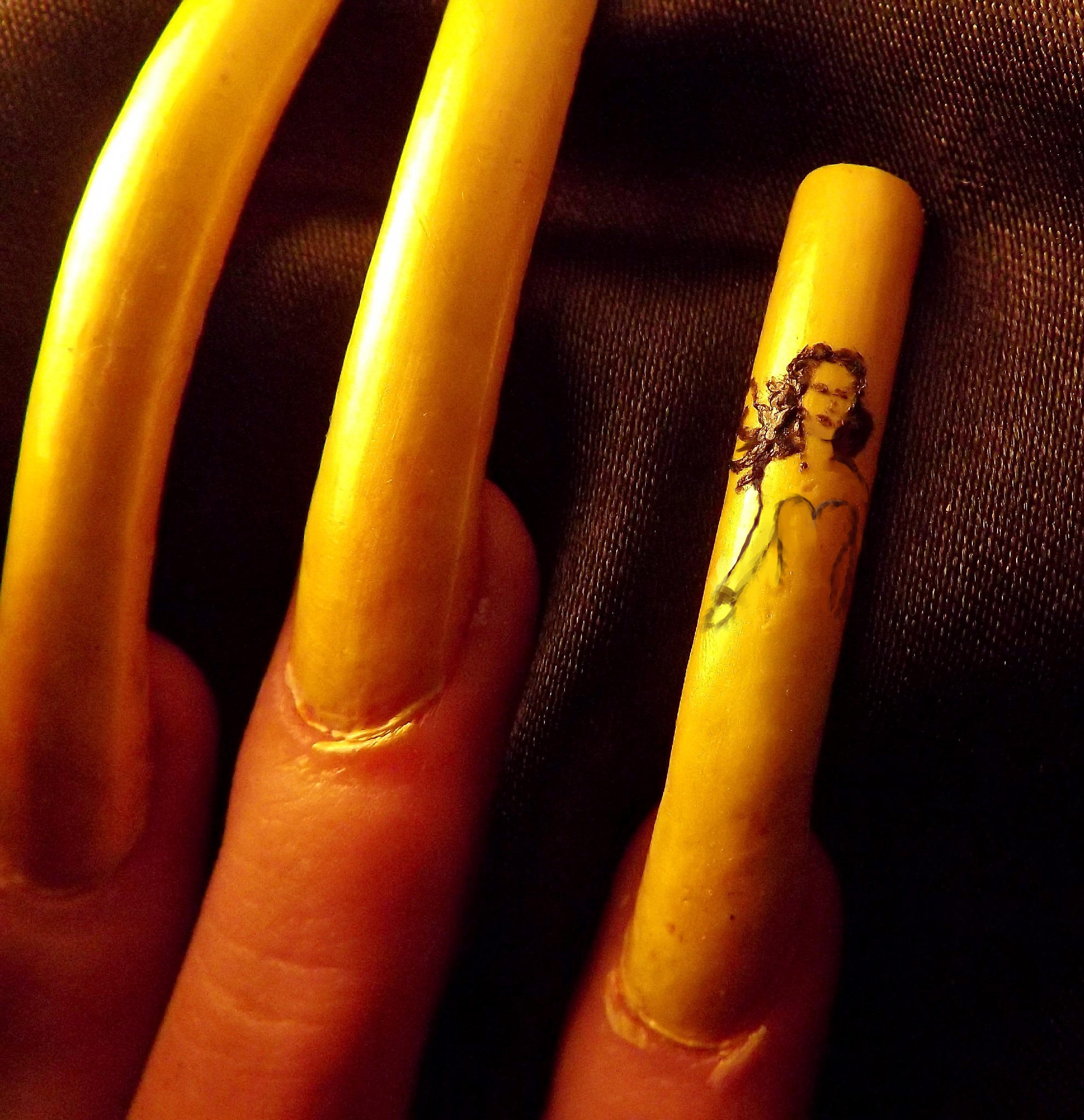
The body; Still using the same fine tipped brush, as mentioned above, you will have to follow with the proportions, again if something goes wrong either just pick a line off with your nails if it has dried, or remove the mistake with a bit of cotton ball dipped in remover, not too much though otherwise you will rub of the base polish.
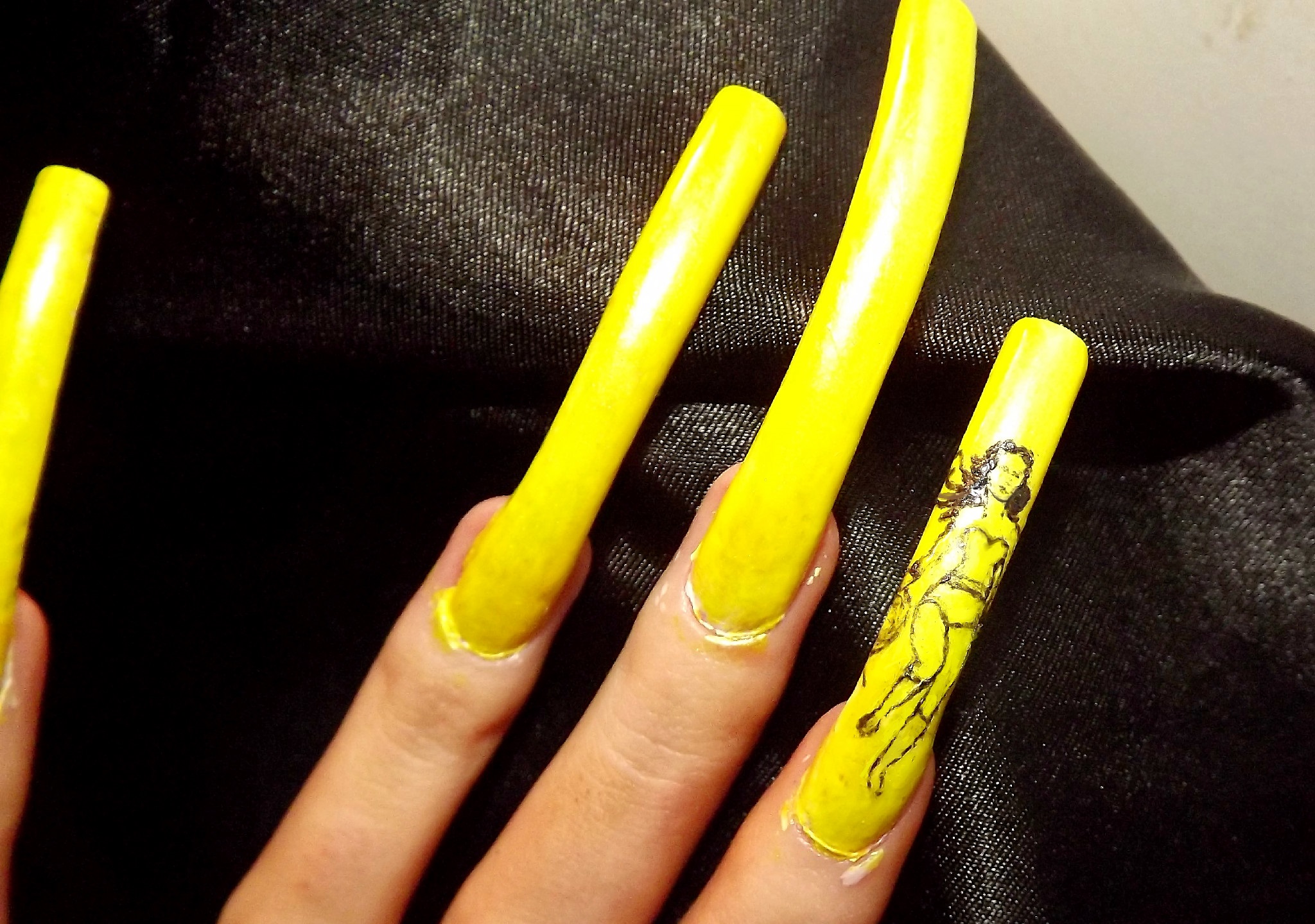
Colour; Once you have completed the body and are satisfied with the proportion, you can now start adding colour, this is the easiest part and is what makes laying down an outline worthwhile. You can now switch to a larger tipped brush, I'll upload some pics soon of the brush selection I have used for this particular nail art.
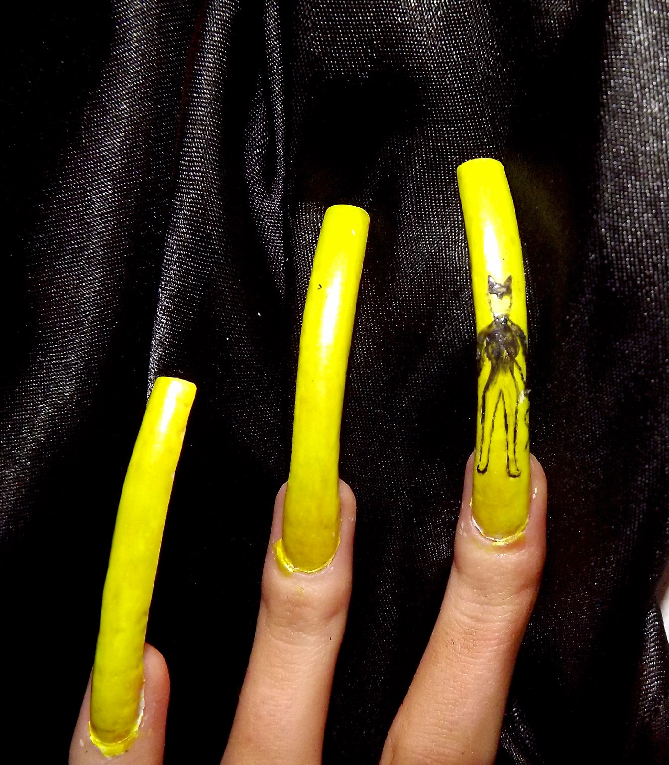
Continuing with the body, you can now start filling in the outline, as I said above, if you made any mistakes this really doesn't matter as you can now paint it over, this is what is best about designs that don't require much colour to them.
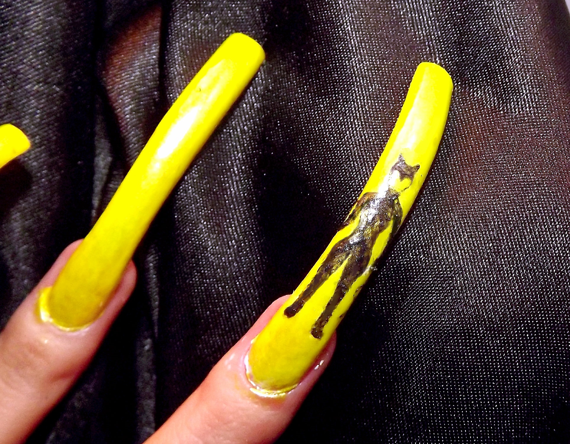
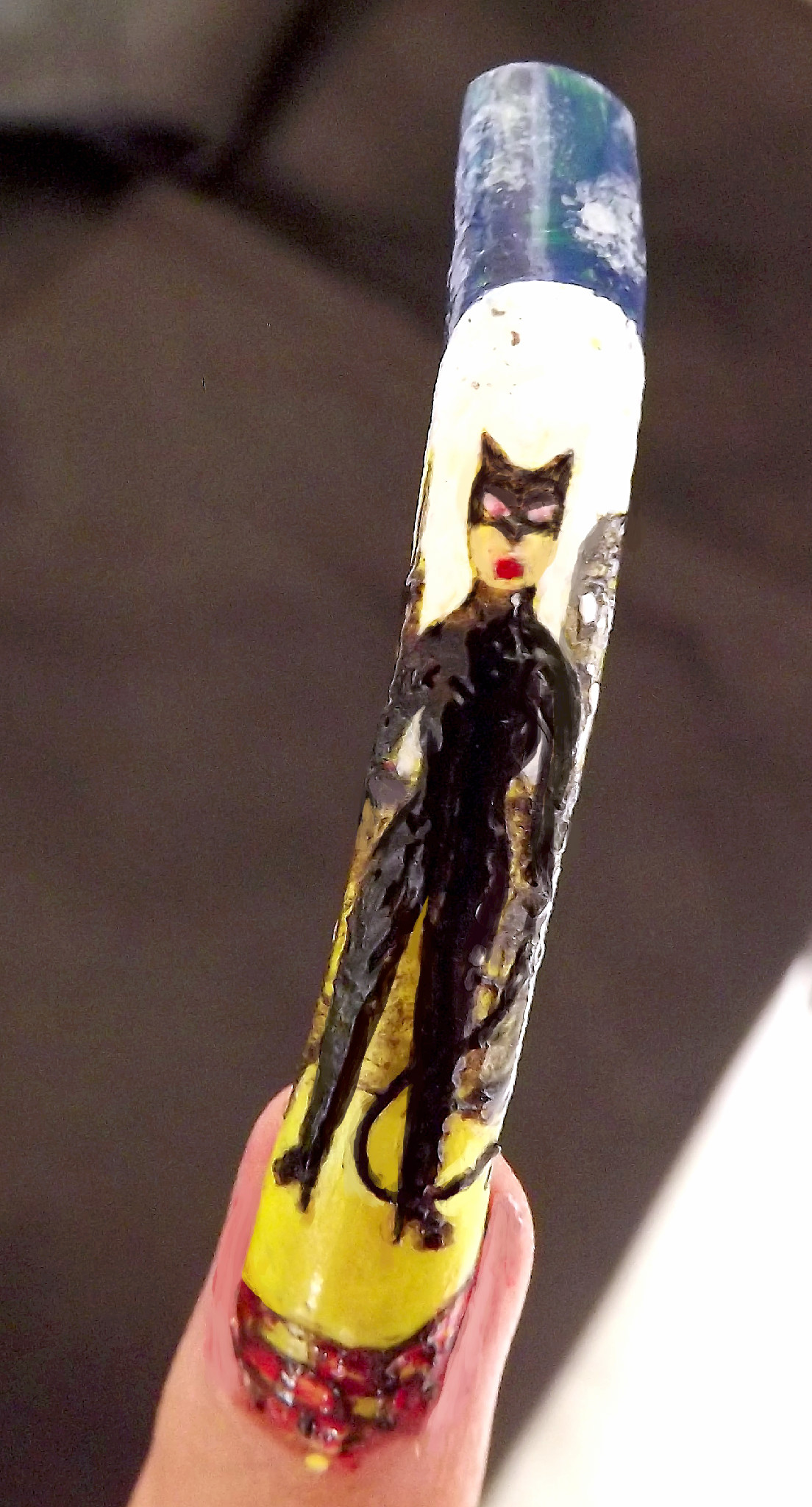
Catwoman complete; Any other detail e.g. backgrounds can be added later around the main design/figure. Now on to Superman.
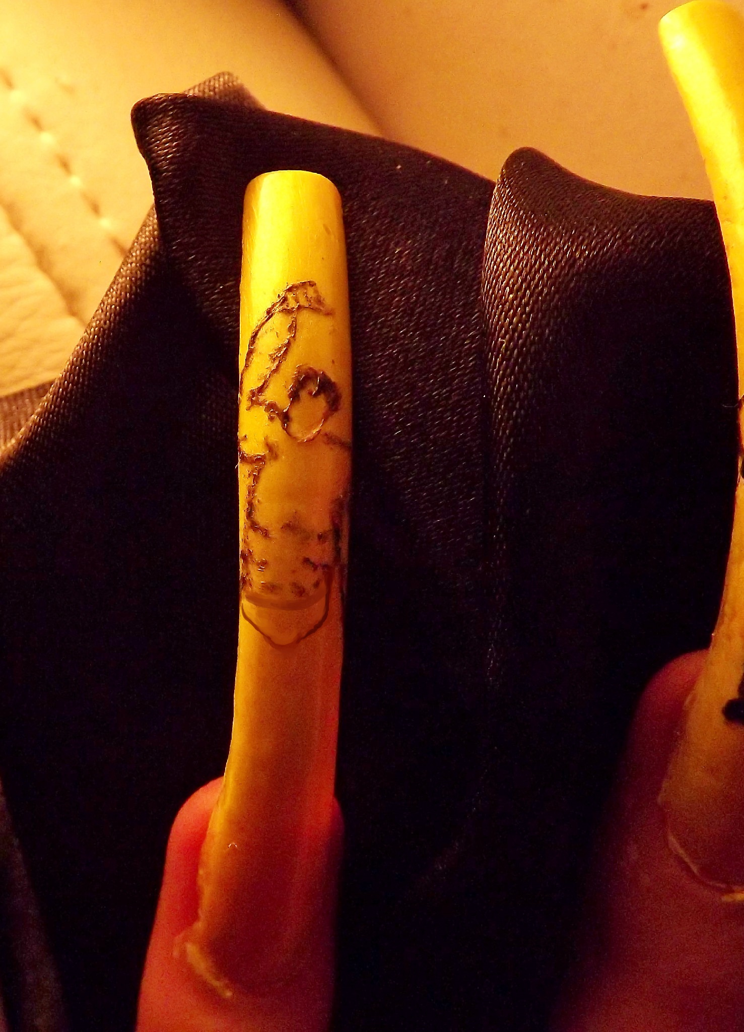
Superman layout; Here I start with the outline of the torso and head, as you do this you may find it easier to do definition if you are trying to create a muscular appearance, it gives you a better perspective of how the body will look and gives you a better proportional idea.
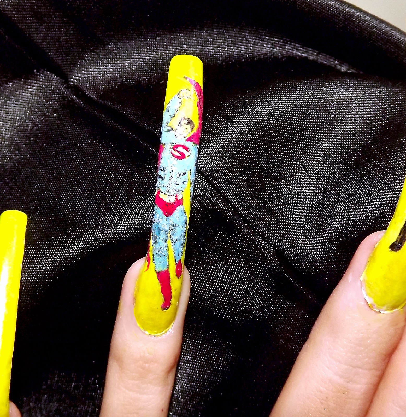
Adding colour to Superman; With the colours being a brighter selection, you have to be more defined in your detail here once you start creating the muscles, any mistakes could be sneakily painted over and redone but because the blue is very light, any errors in black will likely still show through as grey. The cape etc is the easiest part here.
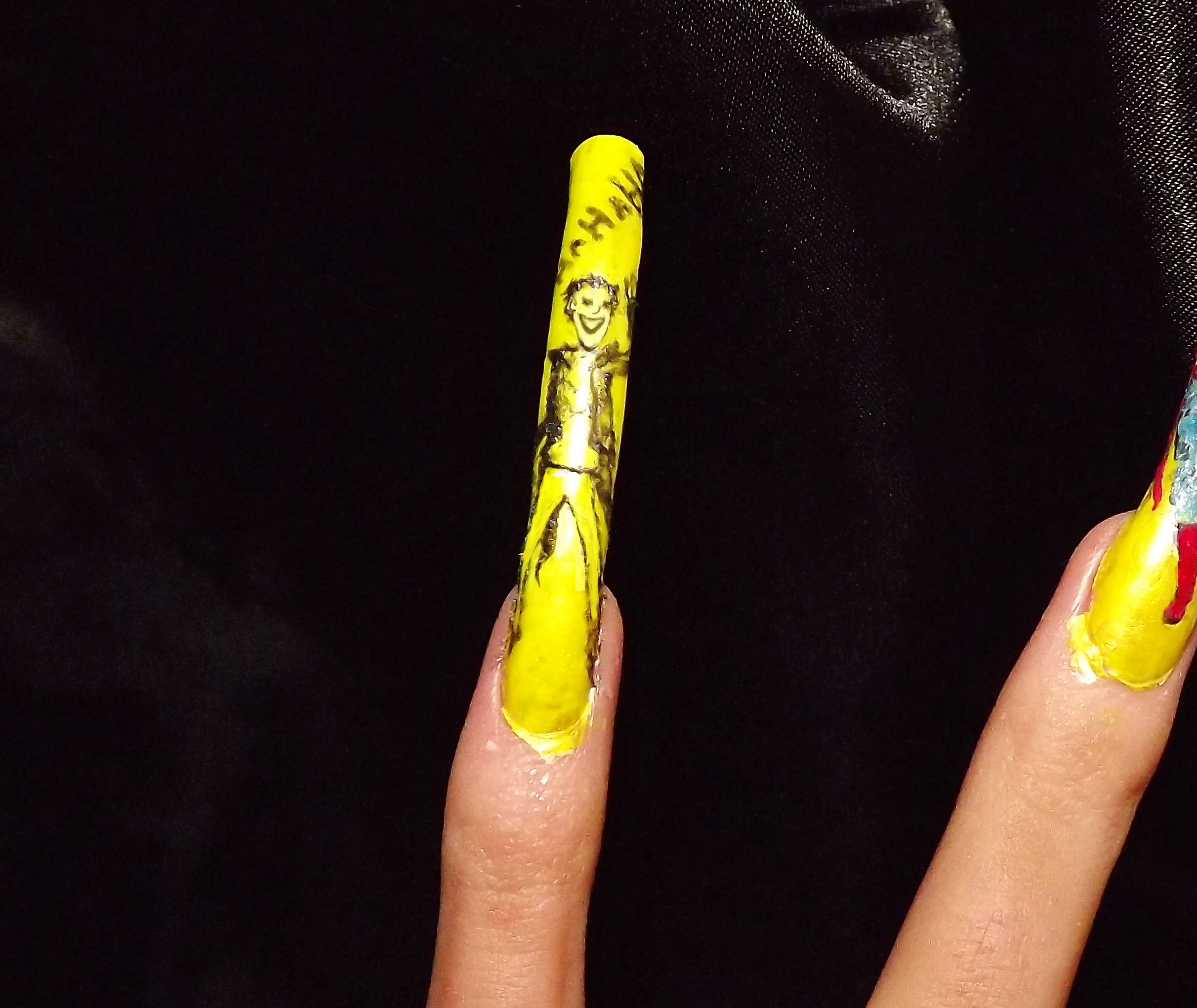
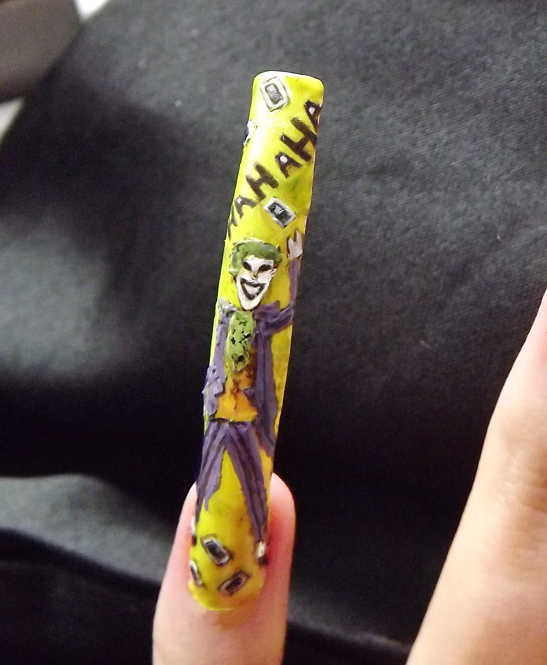
The Joker; His layout wasn't too difficult, not a major amount of detail is needed on the body, only the face, because his character has a very recognizable facual look it really needs a lot more time to create, there is a limitation on how detailed you can get on such a small/narrow canvas 'nail plate' especially if you are including a body. If you decide to do just the face, far more detail can be added here.
Colouring the body; There is only three colours that are needed here, apart from black, if you don't have an exact shade, you can do a mix of two or three shades on a piece of paper or on a pallet if you own one, after all you won't need much polish just a small blob of each. Here I have already done the background details but this personally is just an extra.
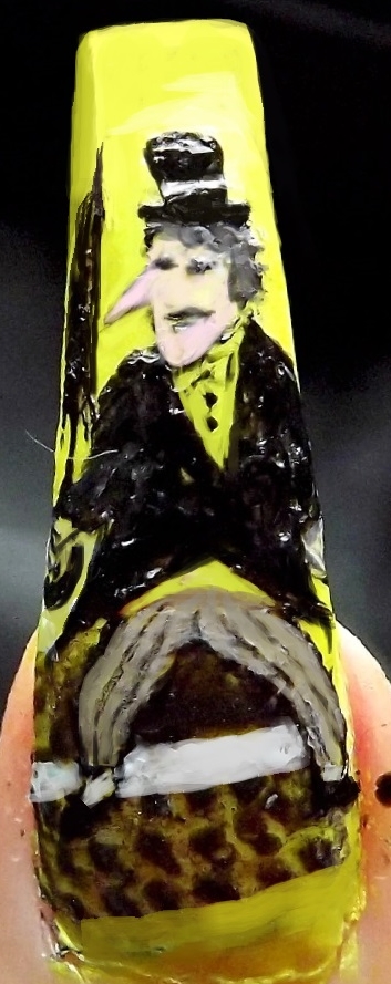
The Penguin; I didn't do step by step tutorials of my thumbs characters, but The Penguin is, although might not look it, is very straight forward to do, there is only three colours needed for this one, and again with it being mostly black, any mistakes can be disguised.
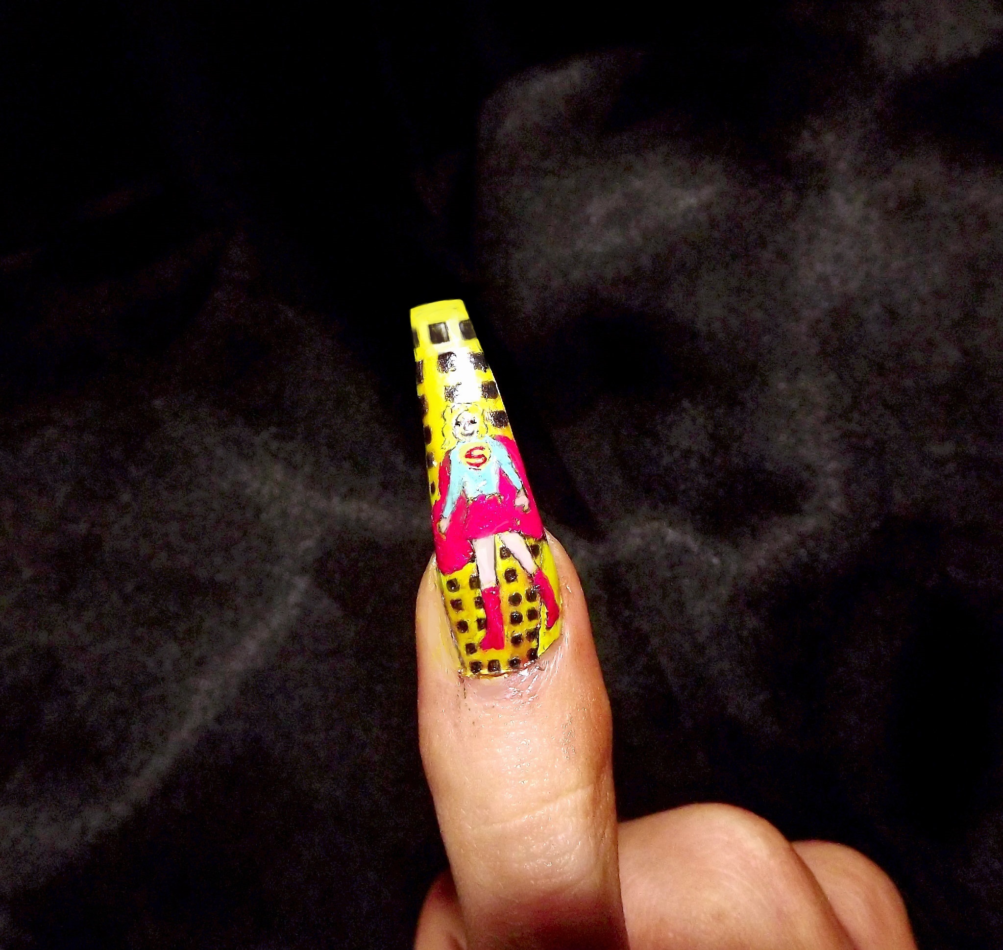
Superwoman; Below is my design of Superwoman, like above I didn't bother doing tutorials for either thumb nail, as well as for The Riddler.
Superwoman, very similar to Superman in layout and colours, just remember to be more feminine in detail, and not add too much muscular definition.
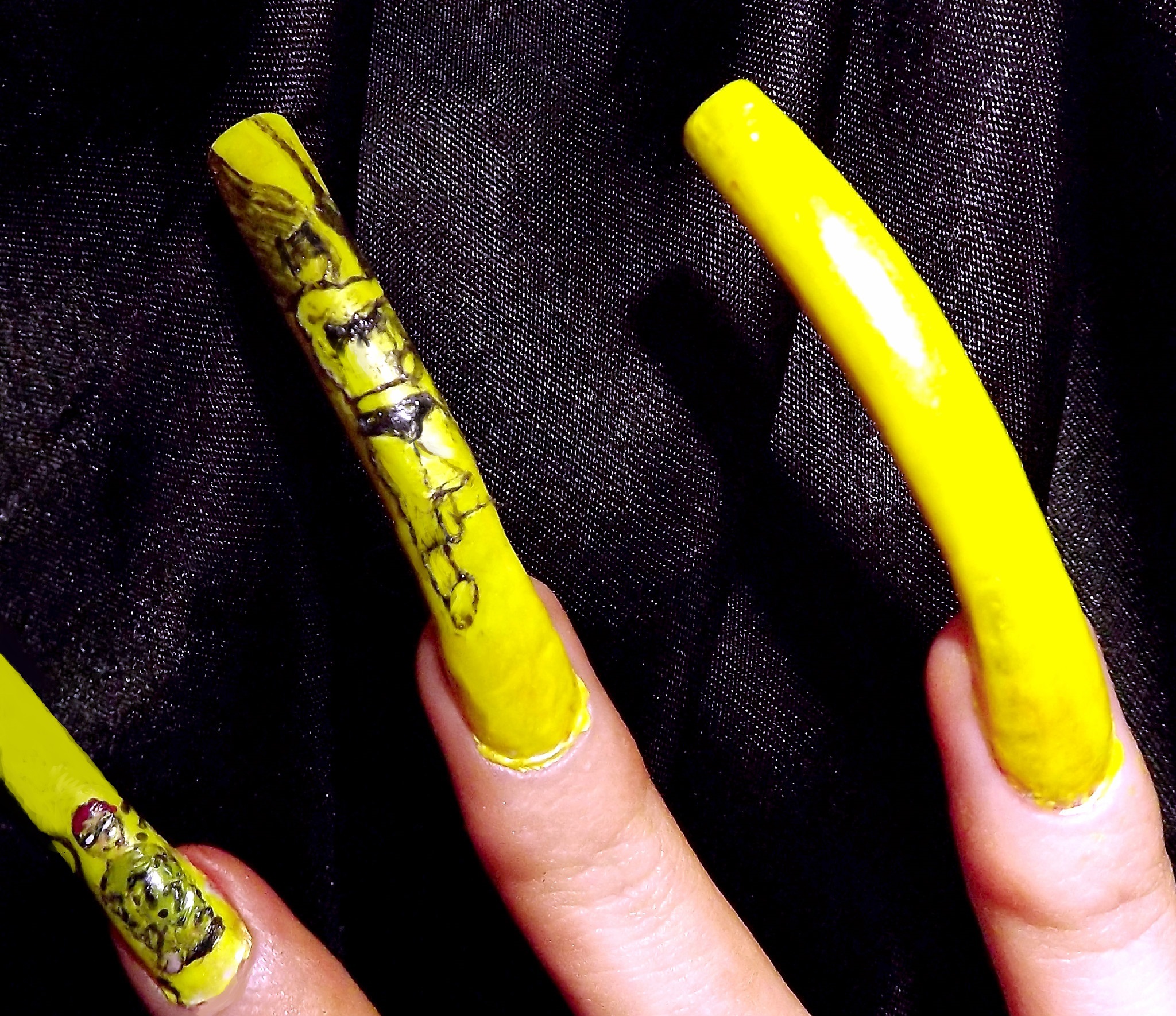
Batman; This was the most troublesome character to do, my first attempt for the head, cape and torso I wasn't satisfied with, below was my second attempt, once I began to add colour to it though proper definition started to come out.
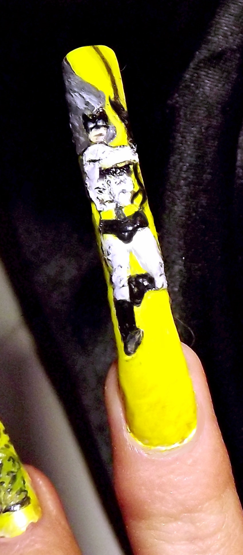
Colour; Once I started adding the colour, I found the definition I was trying to create came out more, at this stage though it was still uncomplete, after this I applied another coat of black into the outfit to make it pop out more from the grey, also adding more muscular definition.
Poison Ivy; Below is how I started with the outline for her character, I was sure not to forget the vines :-p
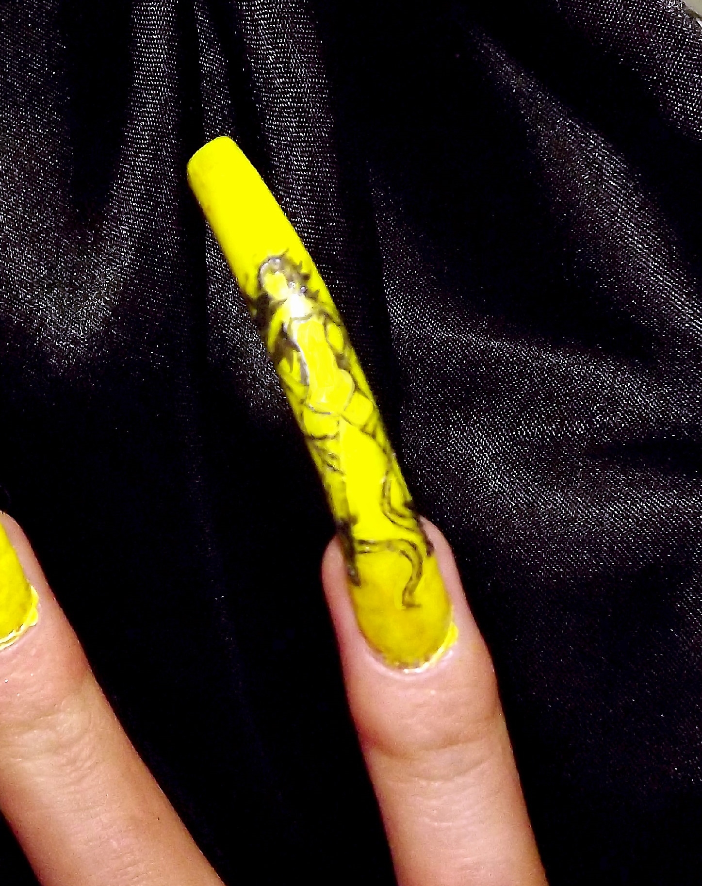
ColouringPoison Ivy; I used a mix of greens and browns for these vines, along with her outfit, in the colouring aspect this character took more time, due to creating a leaf effect throughout.
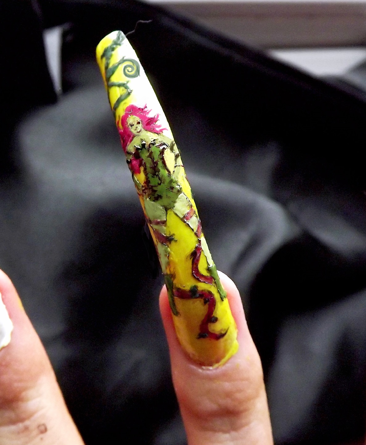
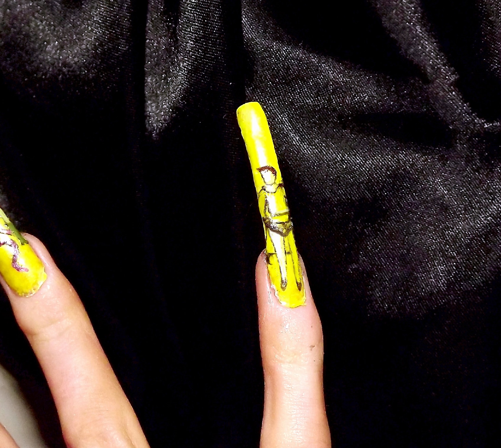
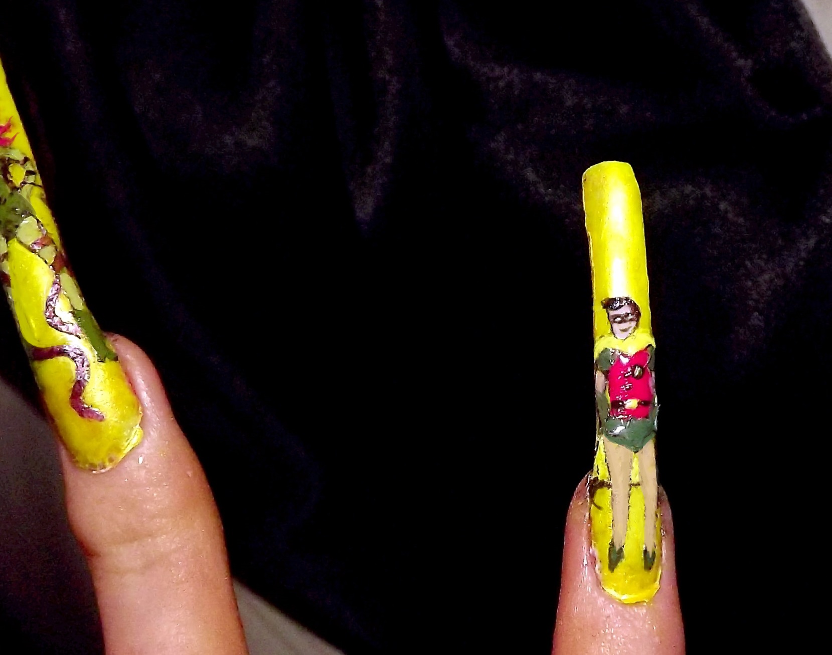
Finished designs..

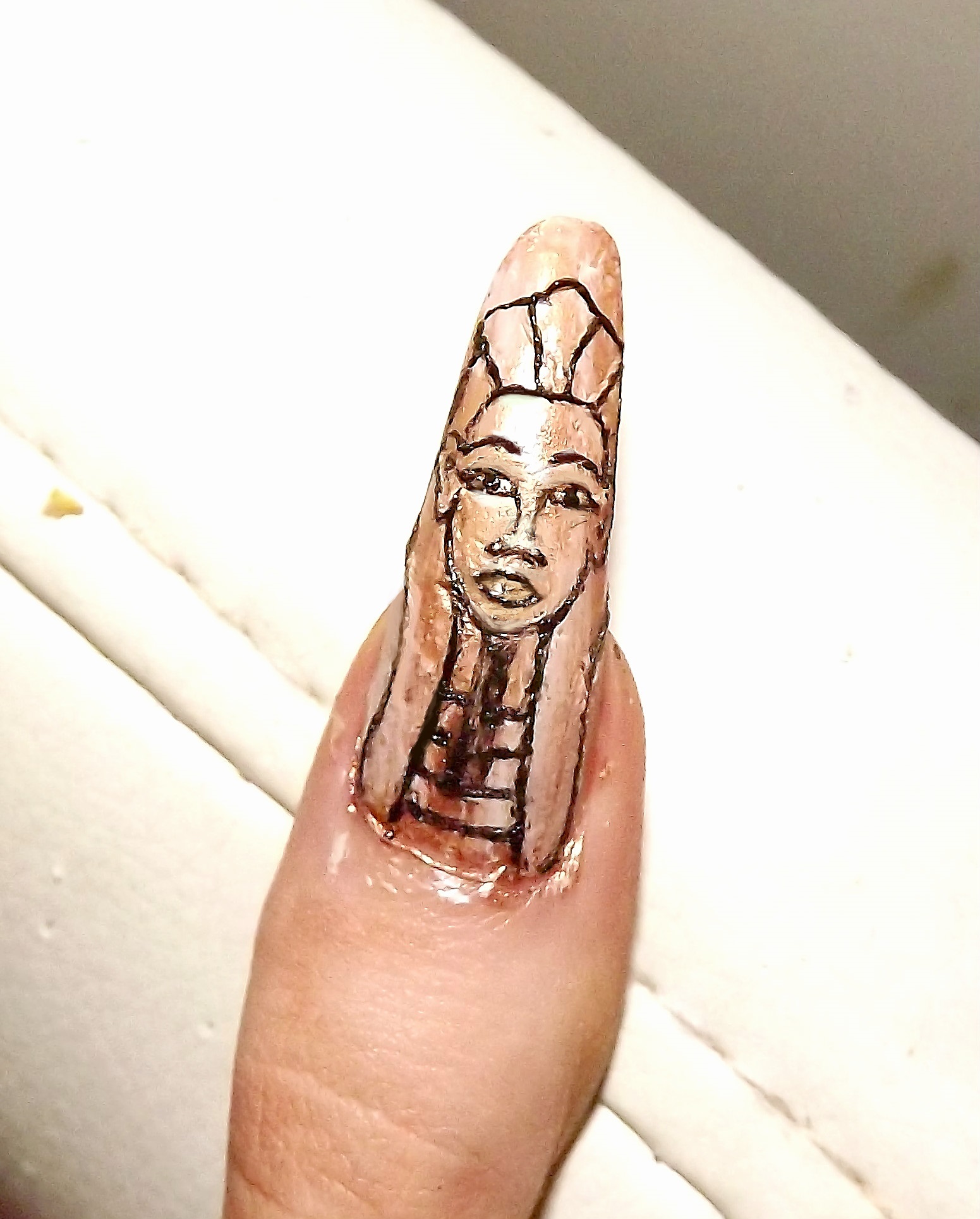
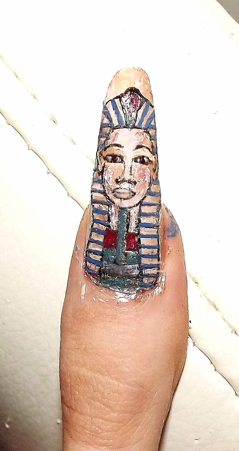
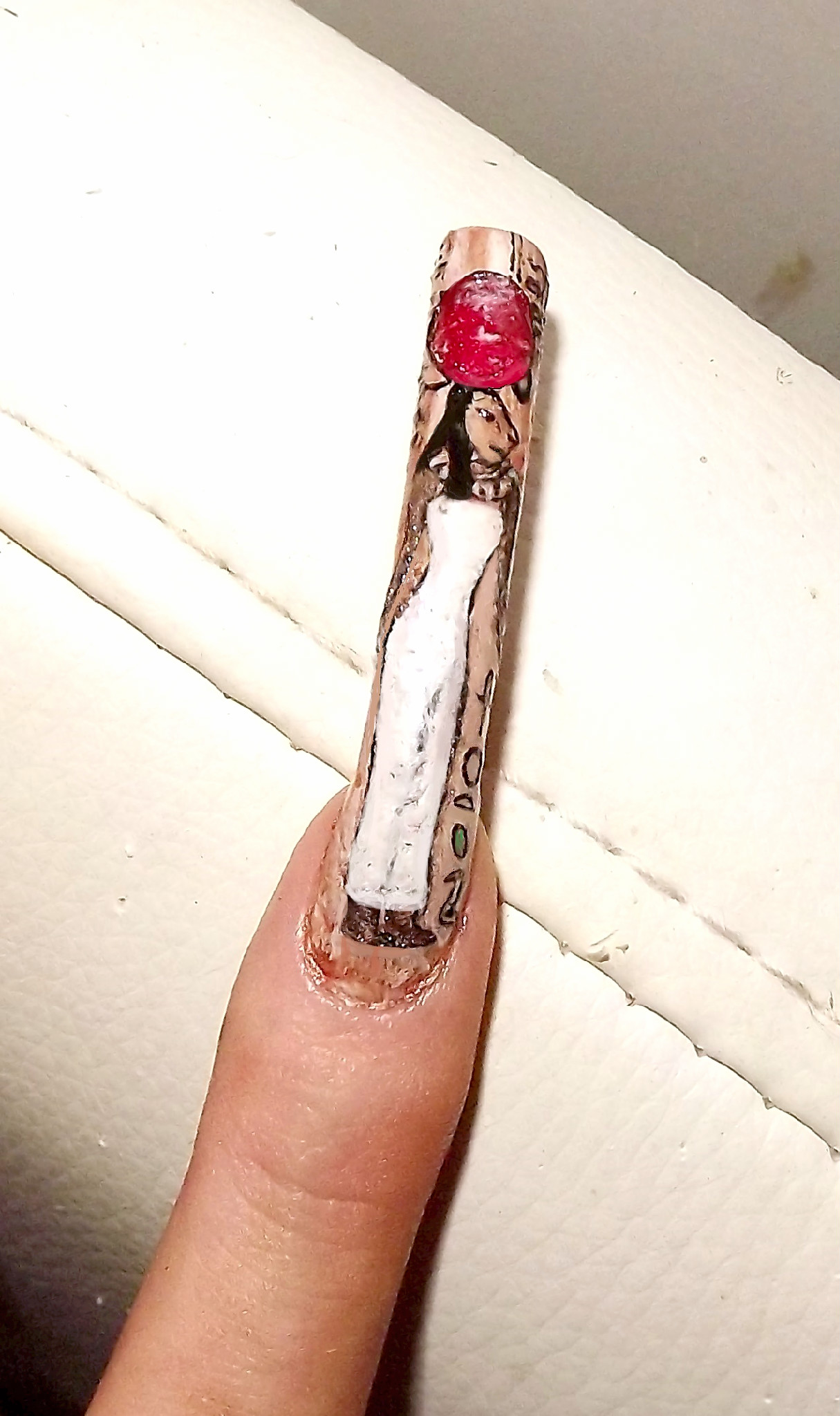
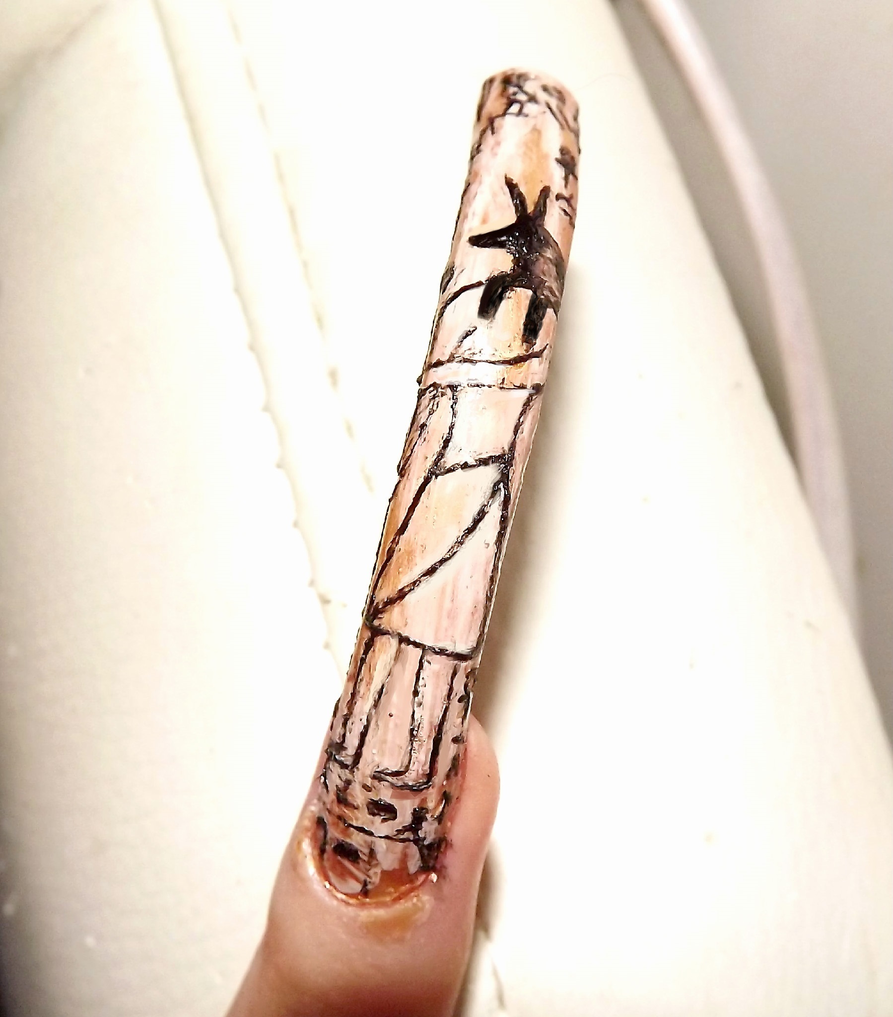
Seth ; God of Chaos. Before and after.
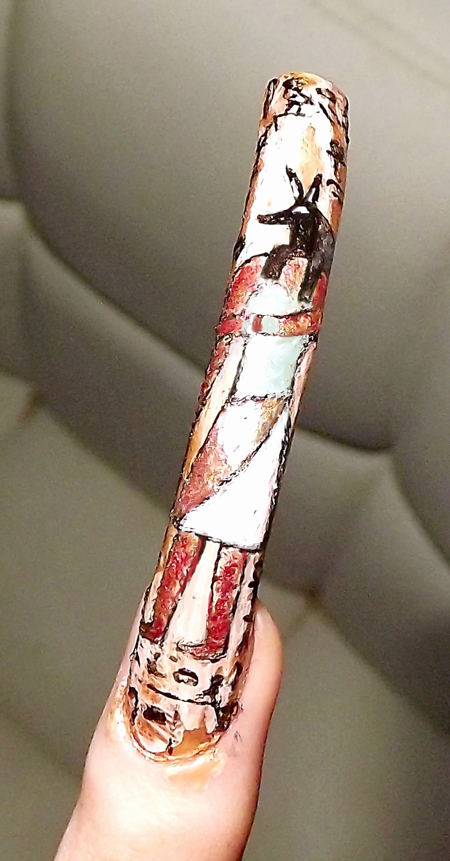
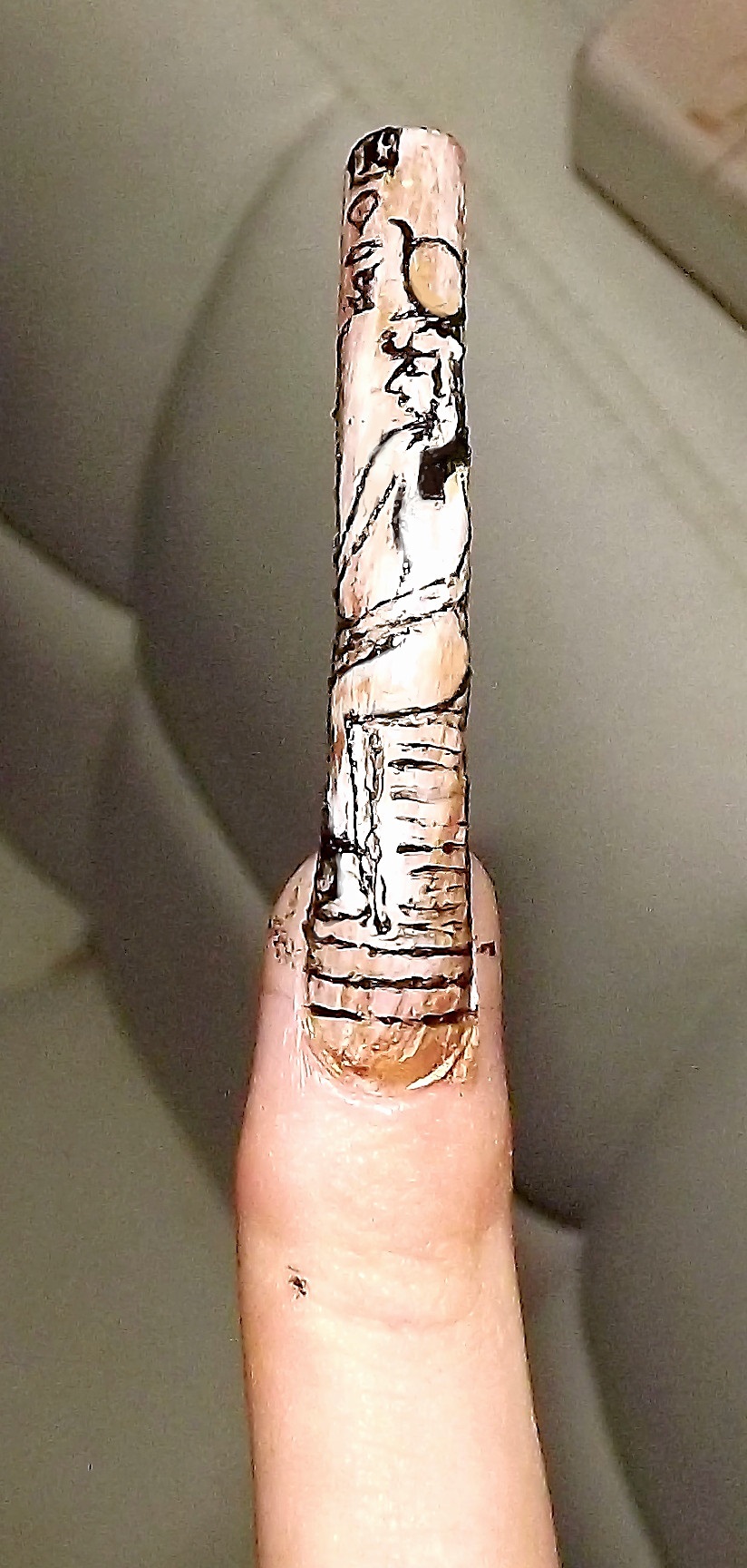
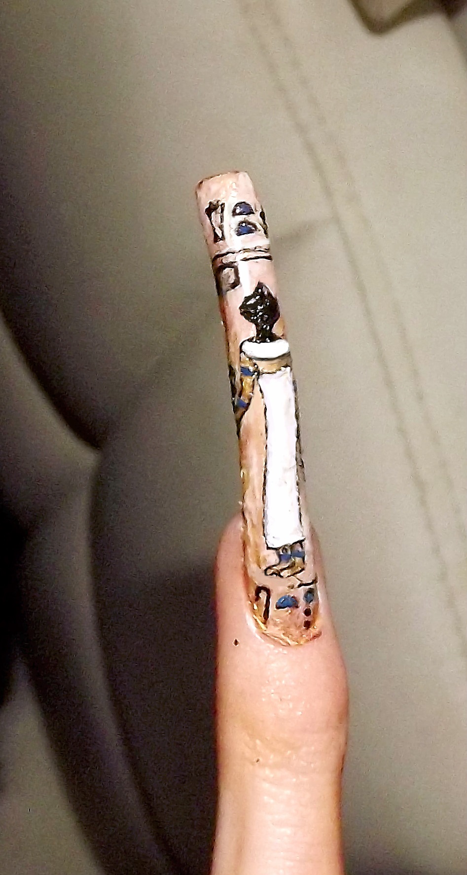
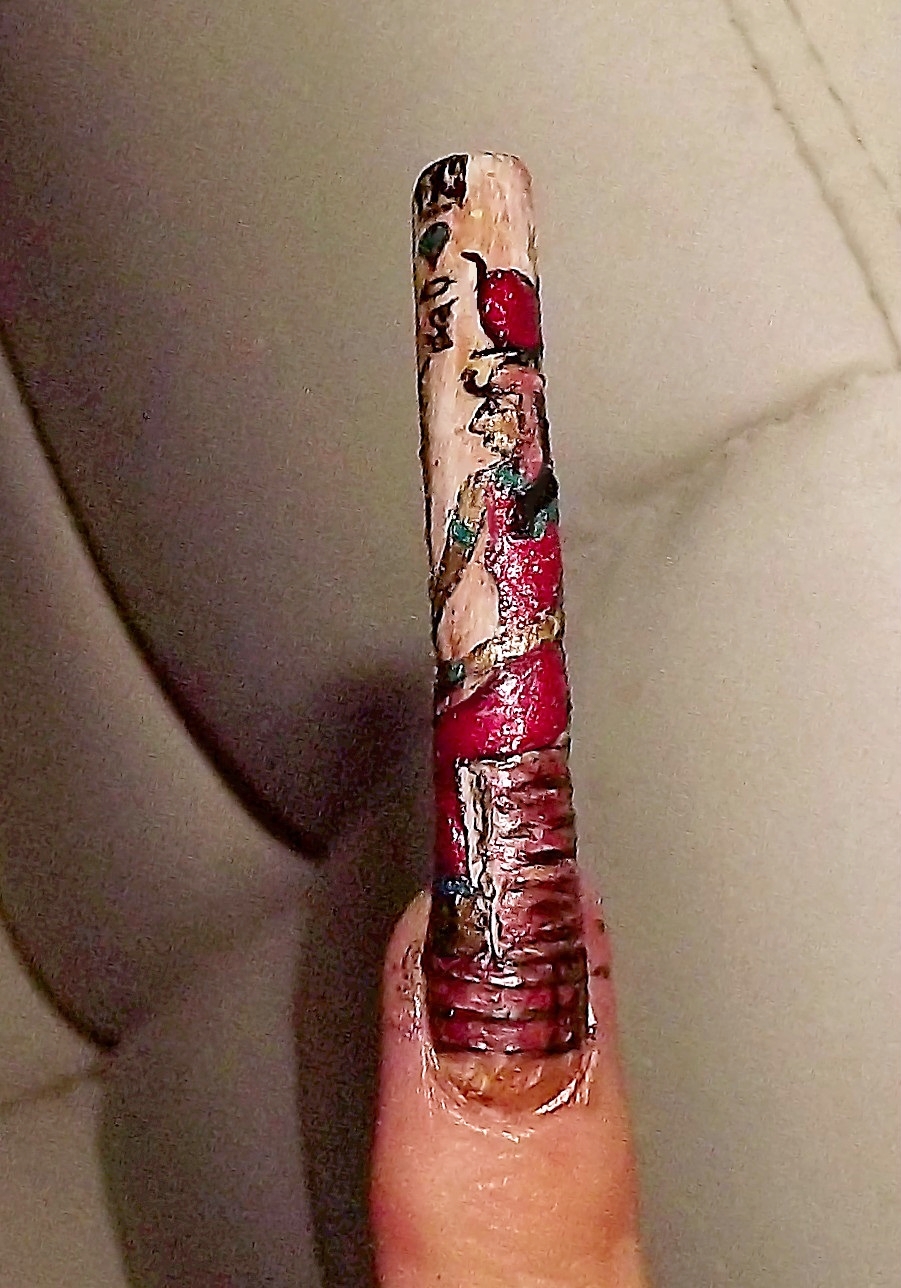
Hathor; House of Horus (Goddess of love and joy) Before and after.
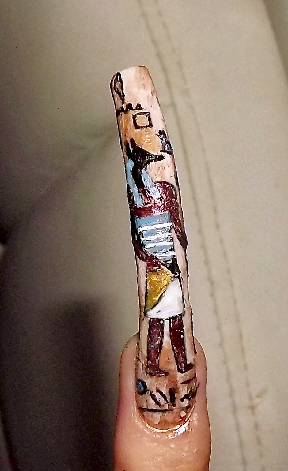
Horus; The One Far Above. Completed image above.
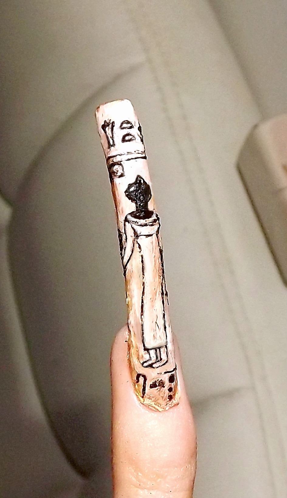
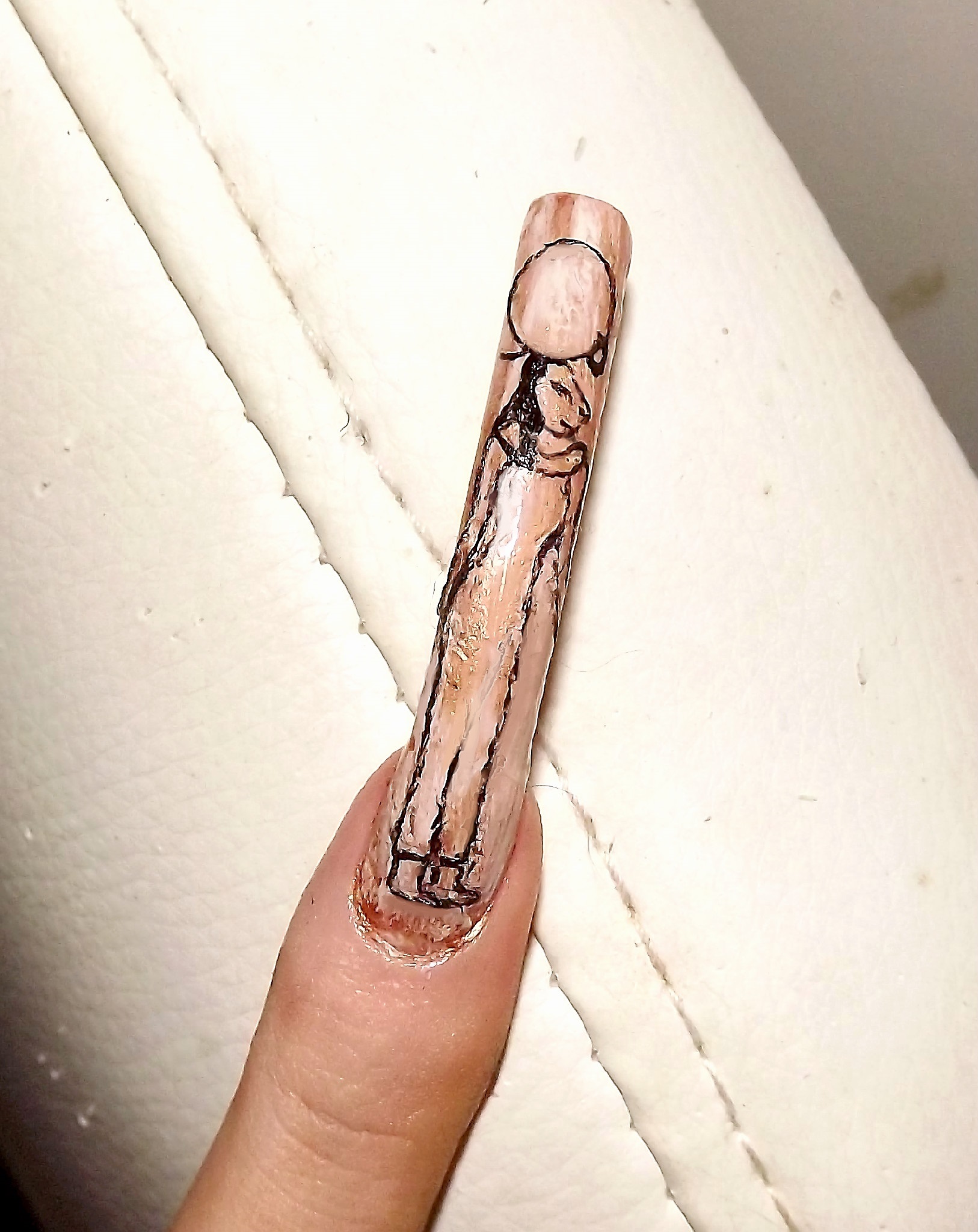
Bastet; Protective Goddess. Before and after.
